Every designer is familiar with typography and and recognizes the importance of this in creating legible and visually appealing letters and graphic symbols. However, not every designer is versed in the anatomy of type, an essential knowledge when creating one’s own typefaces.
Before delving into the components, it’s crucial to recall the two main typeface classifications: Serif and Sans Serif. Serif letters, with their traditional appearance, originated from stone carvings. Decorative elements were added to overcome challenges in achieving a straight finish. Common serif types include Times, Georgia, Garamond, and Courier, frequently used in logos and extensive text due to their readability.
On the other hand, sans serif letters lack the ornamental finishes and are primarily used in titles. They can be challenging for long texts. Examples of sans serif fonts include Arial, Verdana, Calibri, and Tahoma. When working in a digital format, sans serif fonts are preferred for their sharp appearance on screens.
Creating typography involves understanding two crucial measures for letters: X-height and Cap Height. X-height represents the height of all lowercase letters without ascenders or descenders and determines the size. Cap Height is the size every capital letter should have, determined by a letter with a flat bottom, like “E.”
To simplify size management, using a layout grid with reference lines is recommended. Essential lines include the baseline (where most letters align), mean line (establishing X-height), capital line (guiding cap height), ascender line (above mean and capital lines, determining ascender parts), and descender line (below baseline, for descender parts).

Spaces are integral to text, significantly influencing readability. Leading, or line spacing, is the distance between two baselines, enhancing text appearance and readability. Kerning, the space between letters in a word, improves attractiveness and readability, preventing confusion between similar letters.
Lastly, tracking influences the visual density of a text block by adjusting space between specific letters. Unlike kerning, tracking isn’t universally applied throughout the text but strategically implemented. Understanding these components enhances a designer’s ability to craft visually appealing and readable typographic elements.
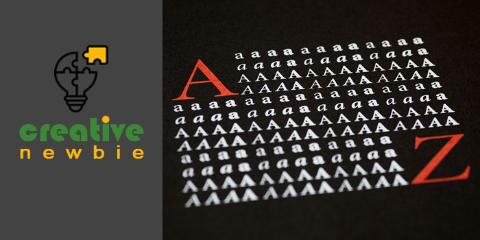
Unveiling the Anatomy of Typography
Now that we’ve explored the crucial elements that contribute to readable and attractive text, let’s delve into the intricate details of the anatomy of typography. The evolution of type has been closely tied to advancements in technology, allowing for shapes and forms that were once unimaginable.
The terminology used to describe different parts of letters often draws parallels with human anatomy, giving letters characteristics like arms, legs, shoulders, and tails. Some terms, such as tails or ascenders, are not directly related to the human body but are easily memorable. Here’s a breakdown of the anatomy features of letters:
- Leg: The part of the letter that descends to the baseline, like the descender part of the letter “k.”
- Arm: Similar to a leg, but ascends, reaching the middle or capital line, seen in the upper part of the capital “E.”
- Shoulder: A curved line that descends and curves to the right, resembling the left human shoulder, found in lowercase “h,” “m,” and “n.”
- Tail: A decorative curve, seen in the descender part of capital “Q,” “R,” or “K.”
- Stem: The main vertical line of certain letters, also the main diagonal line of capital “A” and “V.”
- Ascender: A vertical line that extends upward to the ascender line, evident in lowercase “d,” “b,” or “t.”
- Descender: A vertical line that extends downward to the descender line, observable in lowercase “q” or “p.”
- Bar: A horizontal line in letters like capital “A” or “T,” or in lowercase “f.”
- Swash: An ornamental line, a fancier alternative to a serif, used in capital letters.
- Serif and Terminal: A small line at the end of a letter as an ornament; without serif, the final part is called the terminal.
- Bowl: A curved line creating a closed space in letters like capital and lowercase “D” and “B.”
- Spine: The principal curved line inside an “S,” comparable to a woman’s spine.
- Link: The connection between a bowl and a loop in a lowercase “g” in some fonts.
- Loop: The lower part of the lowercase “g” in some fonts.
- Ear: A small stroke, often ornamental, used in lowercase “g.”
In Conclusion
Understanding the anatomy of Typography is essential when creating a new font, allowing for modification and adjustment based on specific needs. While complexity can be introduced to typefaces, it’s crucial not to compromise readability. Employing proper spaces and sizes enhances the overall text, emphasizing that while typography can be intricate, it must remain easy to understand.