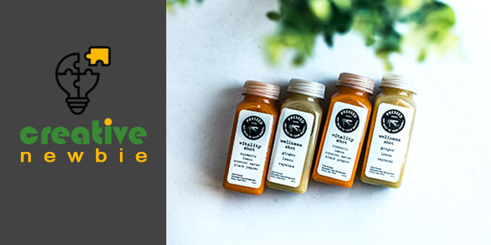
The decision of a customer to purchase a product often hinges on the effectiveness of its label design. Graphic designers adhere to specific principles to ensure visually appealing designs that resonate with consumers and secure a prominent spot on store shelves. Failure to present a product correctly can lead to missed sales opportunities, making it crucial to follow established label design principles for increased profitability.
5 Essential Label Design Principles
Discover the rules that can give you a competitive edge:
1. Precision is Key
Ensuring the accurate display of product information is vital for securing shelf space. Research and incorporate essential details, making it easy for consumers to find pertinent information without unnecessary complexity.
2. Stand Out from the Crowd
Distinctive label design is essential for brand visibility. Utilize unique materials, design styles, or printing processes to set your product apart. Quality packaging attracts customers, so employ creativity and visual elements strategically to captivate buyers.
3. Manage Expectations
Misleading customers by exaggerating product qualities may boost initial sales but will lead to long-term dissatisfaction. Align the presentation with the actual product to build trust and foster repeat purchases.
4. Adaptability
When designing packaging for diverse products within a brand, ensure graphics suit varying shapes and sizes. Maintain a consistent look across the collection for instant brand recognition.
5. Thoughtful Redesign
Approach label redesigns with care, retaining key elements from the original design to evoke brand recall. Balancing creativity with familiarity requires skill and dedication to achieve the desired quality.
7 Trendsetting Label Design Styles
Explore popular label design styles for inspiration:
1. Vintage Appeal
Capture the essence of bygone eras using modern technology, employing decorative elements to evoke a vintage aesthetic that resonates with consumers.
2. Eco-friendly Solutions
Embrace sustainability by using biodegradable materials and avoiding excessive packaging. The eco-friendly design sends a responsible message to consumers.
3. Innovative Die Cuts
Utilize die cuts creatively to showcase products, allowing customers to inspect quality. Innovative die-cut designs, as seen in Good Hairday Pasta by Nikita Konkin, can elevate your packaging.
4. Distinctive Typography
Choose typography strategically to add flair to your label. Unique fonts create retro vibes, bold statements, or luxurious looks, contributing to enhanced visibility and differentiation from competitors.
As a graphic designer, incorporating these principles and styles will not only elevate your label designs but also contribute to brand success in a competitive market.
5. Timeless Elegance in Black and White
The classic combination of black and white packaging stands as a timeless trend, especially favored for luxurious label design. Enhance this style by incorporating varying color opacities or introducing subtle splashes of color to captivate attention. The stark contrast of black and white instills a sense of seriousness and dominance.
6. Vibrant Color Palette
For those who prefer to steer clear of the black and white paradigm, opting for wild and vibrant colors can be a compelling choice. This unique color selection not only attracts customers but also imparts a sense of joy, youthfulness, and freshness to your brand or product. Ideal for hip products, consider adding irregular patterns and shapes to infuse additional flair. A standout example of this style is evident in the design of NICHE Tea by IWANT Design.
7. Masterful Minimalism
Minimalism remains a popular trend in packaging design, presenting a clean and sophisticated aesthetic. While widely embraced, achieving the right balance can be challenging. Striking the perfect equilibrium is essential—too minimal, and the design may appear sterile; too many elements, and the minimalist essence is lost. To exemplify this style, beer labels offer an excellent canvas for creative expression.
Best Beer Label Designs for Inspiration
Explore these exceptional beer label designs for creative inspiration:
1. Goldhawk Ale
Named uniquely, Goldhawk Ale’s label design forgoes additional text to highlight the product’s characteristics. A transparent yellow label complements the Ale beer type, ensuring it stands out on the shelf.
2. Sakiskiu Alus
Designed by Sigitas Guzauskas, this beer label showcases a remarkable use of a rubber stamp and handmade paper, adding a touch of genuine craftsmanship to the design.
3. Russell Brew Co. Angry Scotch Ale
Breaking conventions, this brand opted for printing graphics directly on the bottle rather than using a paper label. This innovative technique sets them apart while being cost-effective and environmentally friendly.
4. Cervecería Sagrada
Renowned for its vibrant label, this Mexican beer brand drew inspiration from the colorful masks worn by Lucha Libre wrestlers. The label serves as a distinctive nod to Mexican culture.
5. 1295 Brewing Co.
Embracing simplicity, Ben Hough’s home-brewed beer label boasts a minimalistic black-and-white color scheme, offering a refreshing contrast and a competitive edge in the market.
Final Thoughts: Principles of Exceptional Label Design
Label design plays a pivotal role in a product’s appeal to customers. It serves as the initial point of interaction, conveying the values and features of the product. Transparency and authenticity are paramount, with the need to draw inspiration from successful brands while avoiding exaggeration of product quality. Whether adopting a minimalist approach or experimenting with vibrant colors, the chosen style must align seamlessly with the brand’s beliefs and resonate with the target audience.


